Thursday, 24 June 2010

Paper Stock and Print Specification

Print Specifiction Sheet

Student Name……Chris Mann…………………………………………………….

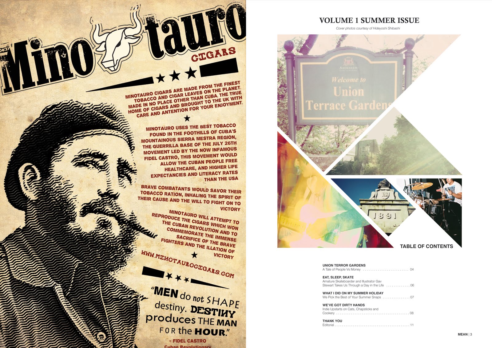
Title of Publication – Mean Magazine and A3 Poster

Publication Date – 15.06.2010

Print Process (Colour CMYK, pantone references, tints)– Standard CMYK

Size – A3

Number of Pages – 8

Number of Copies – 1000

Stock Paper/Card (Manufacturer, range, colour, weight) – Traditional Newsprint. (49gsm)

Finishes (Folds, varnish, emboss, die cut) – Middle Fold

Binding (Side stitch, comb, spiral etc) – Saddle Stitched using three staples.

Fonts Used – Helvetica, Helvetica Neue (light), Calisto MT

Software Used and Versions (Including operating system) – Adobe Illustrator for documents and page layout, Adobe Photoshop for images

Linked Files (Image files) –

Also Enclosed – A3 Poster, same applies.

....................................................................................................................................

I knew from the beginning I wanted to print this magazine on newsprint to give it an authentic feel.

I had originally intended to print the magazine in A2 (folded into (A3) pages but due to accessible resources I was unable to.

The poster will just be printed on standard paper and be A3 in size.

Promotional Poster

This is the promotional poster for the magazine. Again using my own photography. To get the squared effect, I again used the clipping mask tool in illustrator with one whole image and divided it into squares and then done the same with one big pink square. I used big font styles to attract the eye to what the poster is promoting.


Double Page Spreads (As ready for print)...cont


This is the front cover and back page as they will be put to print. I put a cheeky advert for me as a graphic designer on the back.

Double Page Spreads (As ready for print)

This is the inside page to the cover and the editorial on the inside back page.
This is an advert for a product I previously designed in another brief and the contents.
This shows how I have had to mix pages together to work when printed. It shows the opening page of the UTG article with the second page of the Dirty Hands article.
This is the opposite pages from the pages above.

This is the middle spread.

Spreads

Today I am designing my double page spreads. Working with grids and different kinds of layouts. I am going to design the appropriate doubles pages beside each other then order them correctly for printing. There are 2 main double page aticles and 2 single page sections. I will also add adverts and images to fill pages and make it feel more like an actual magazine. I will post the page layout for print seperately to this post.

Contents Design

For my contents, I imported some of the images I took and some images from a friend into illustrator. To make the images the shapes that they are, I used the clipping mask tool. Fonts used are Helvetica and Calisto MT. I may still change some aspects of this design.


Photos

I went out and took some of my own photos to use within my magazine.